HR materials can often feel sterile and corporate. When MIT rebranded, it presented MIT’s Human Resources department with a huge opportunity: to create a new site and visual identity. But this new design had the potential to be both exciting and joyous while remaining professional and approachable—just like the people MIT HR serves every day.
Website Design & Development
Marketing Materials
HR is presenting critical information. We wanted this new look and feel to capture our audiences’ attention, but we also needed to make sure people took the information seriously.
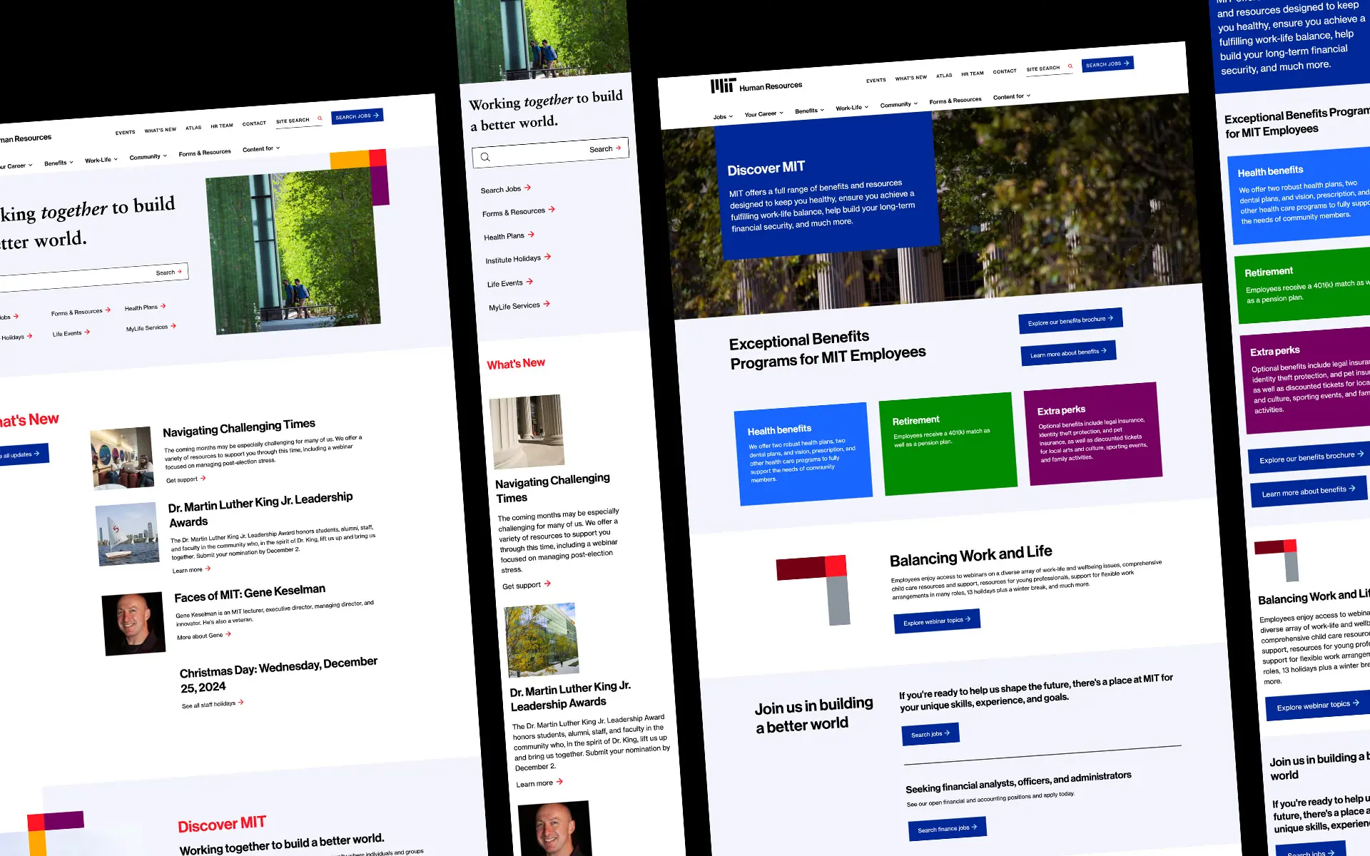
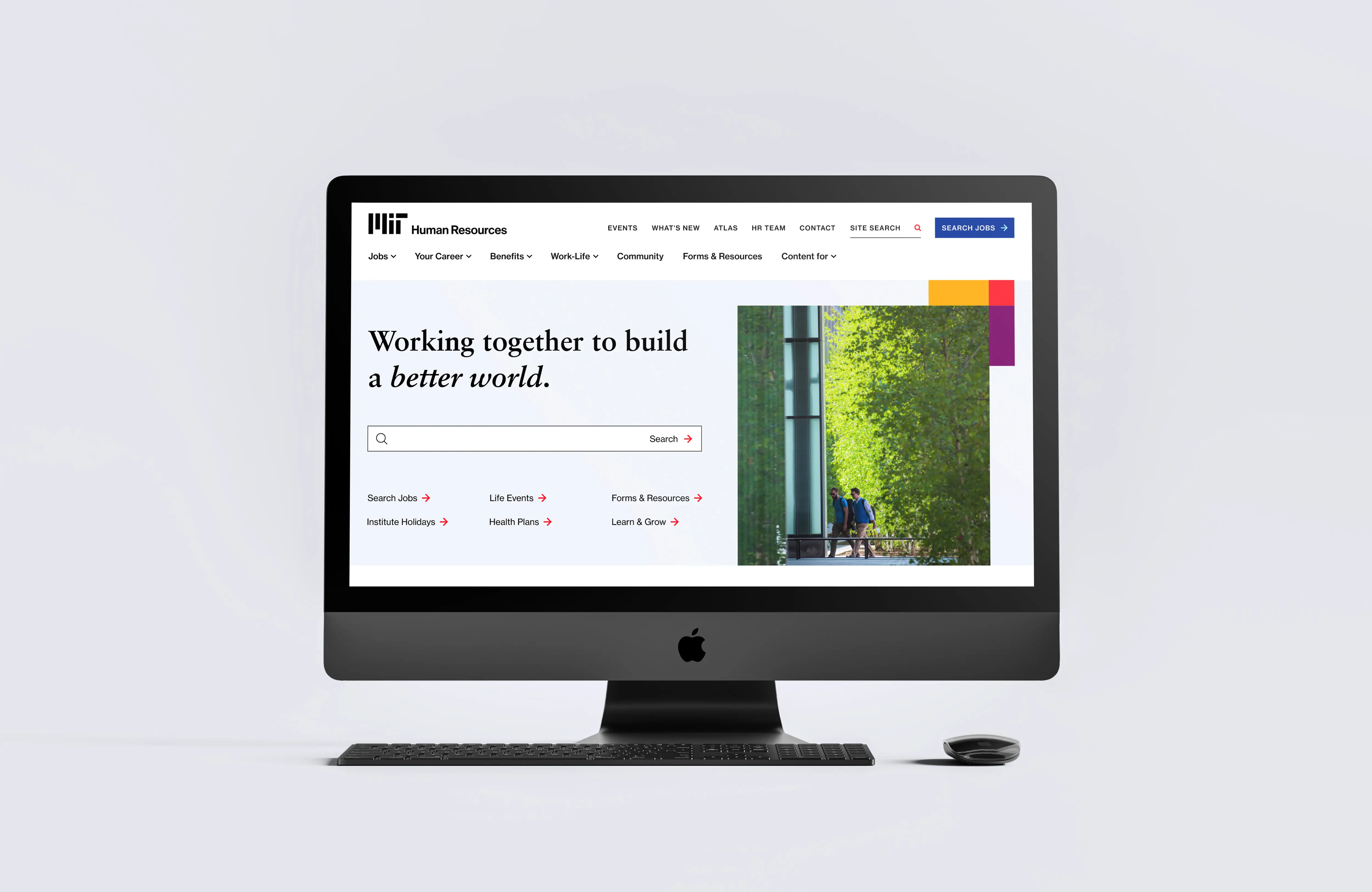
Luckily, MIT’s rebrand gave us plenty to work with. We used different shapes that are mirrored from the logo to create framing elements that felt cohesive. Plus the extended palette gave us plenty of options to bring color and harmony to the website and other materials.
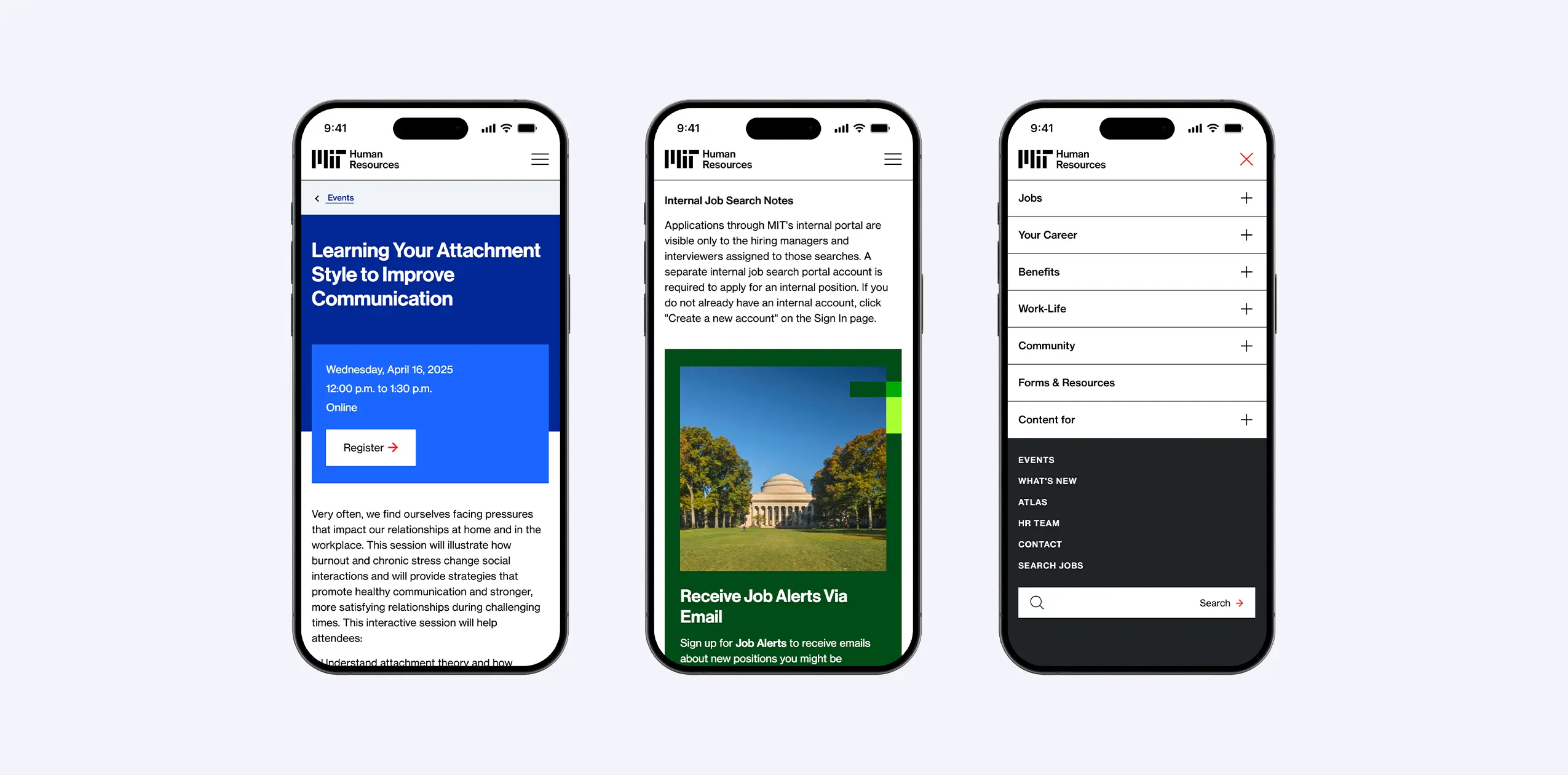
Everyone wants to find things quickly, but HR information can carry an extra level of urgency. Our analytics review revealed what users were most interested in, and we promoted those items accordingly on the site and within the navigation.
The website also gave us the chance to pressure-test our design choices. We used geometric elements inspired by the logo to add a bit of subtle motion to the site. Dynamic, but not distracting. All of these pieces led to an inviting, easy-to-navigate hub borne out of best practices and user insights.

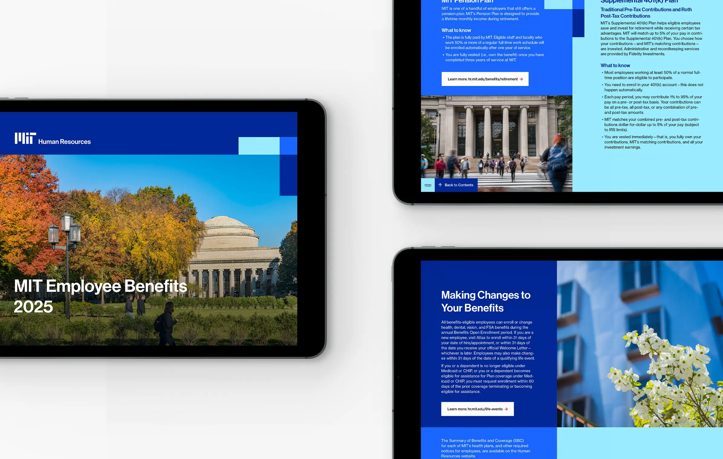
Now it was time to bring this new look and feel—the face of MIT HR—to other elements. When we designed the MIT brochure, we brought it to life in a horizontal format because most people were using screens. Making it into a template allowed the team to easily keep the information fresh and the design intact each year.
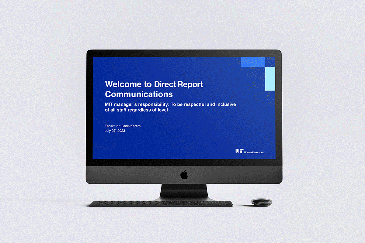
Other materials needed more flexibility. For their PowerPoint and email templates, we provided several color options for the different groups sharing HR information throughout MIT, so that way everyone would get the resources they need to thrive.
Proud to be a certified women-owned business
Proud to be a certified women-owned business
Proud to be a certified women-owned business