Technically, we can’t predict the future of design. But there are some really good guesses out there. After attending the conferences, reading the reports, and listening to the experts, we’re here to show you what we believe will be most meaningful in the year ahead.
Design both reflects and shapes our world. It’s an ongoing conversation: a balance between our past sensibilities and where we’re headed. We created this report to help you navigate that conversation and weigh what feels authentic to you.

1. Mirroring the real world online
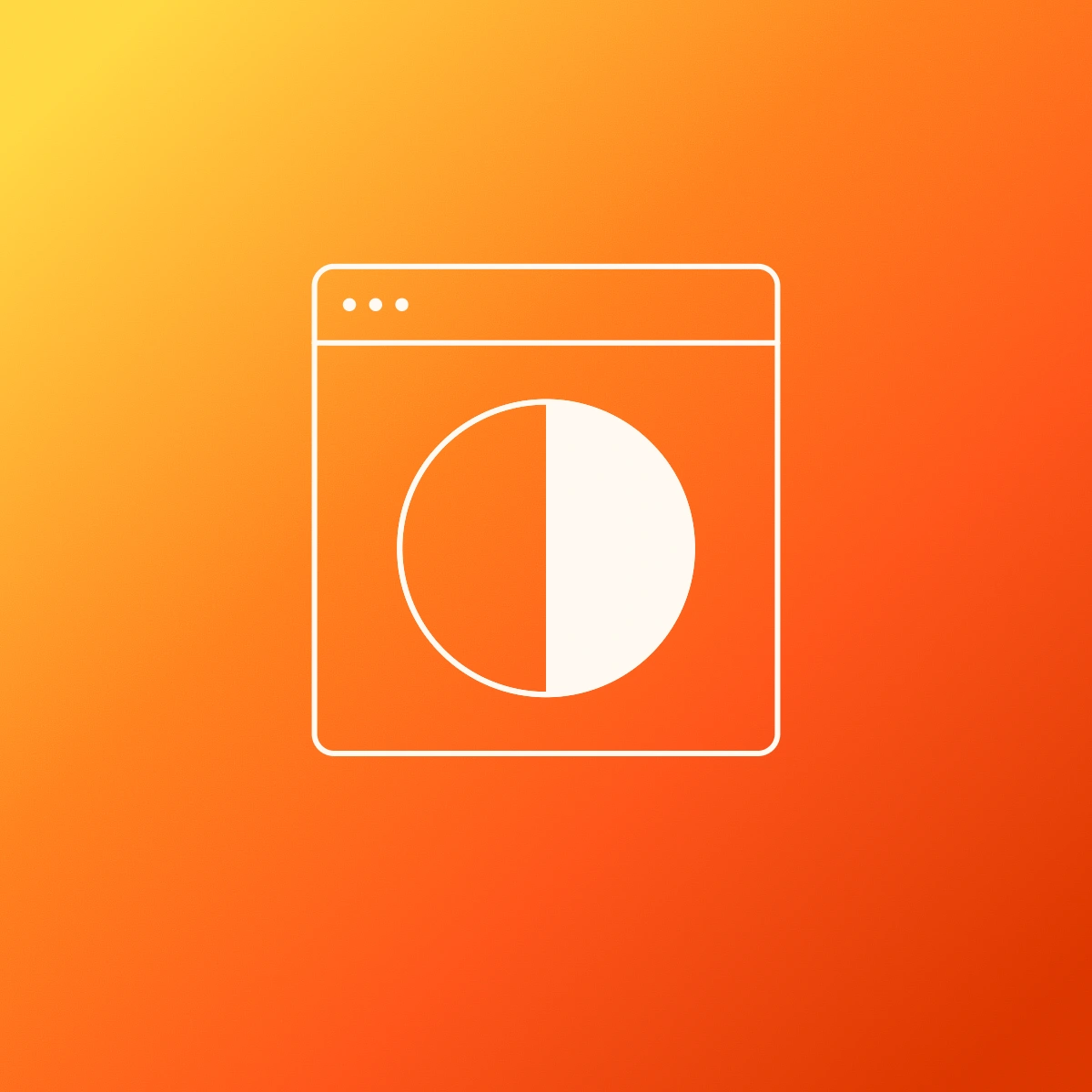
Remember when iPhones were first released and the visuals looked like objects in the real world[1]? For instance, the Notes app looked like a ruled piece of paper. It was to getus used to interacting with novel technology—in that case, full-screen phones (how young we were!)
The same thing is happening with augmented reality (AR). That’s why you’re seeing liquid glass visuals like Google Glass overlays and more textural icons that reflect the world around us like wood, stones, and metals. Our digital and physical worlds have been melding together for years—this is just a reflection of that shift.
2. Moving audiences to action
Even from an evolutionary standpoint, humans are drawn to motion, and more designers than ever have the ability to embrace that. More interactive design experiences put the user in control vs. straight 3D animation; here’s a good example from Shopify[2]. This can help mimic things like real-life shopping experiences in a way that both engages and empowers users. That extends to graphics and typography too, especially in web heroes. Micro-animations and interactions are even more accessible for developers, which create delightful, memorable moments for the user.

3. Coworking with AI
We know, we know—it’s a trend report, so of course AI is going to be featured. We’d be remiss if we didn’t mention it though, because AI offers real intelligence if you use it correctly.
The key is to treat it less like a search engine and more like a creative support tool, one that works best with human-led back-and-forth rather than just sending a prompt into the void. Interacting with your AI tools in an iterative way leads to polished ideas rather than repetitive slop.
By using prompts[3] and integrated tools effectively, you can selectively use AI to help support your ideation, research, exploration, and all of the other things that your humans have you on the hook for. Remember: your uniquely human contextual knowledge and common sense are what lead to truly exciting outcomes. Balancing your expertise with AI’s processing gets you to better results faster than ever.

4. Flaws as features
If you’d been noticing more airbrushed, glowing imagery online, we’re here to tell you that the tide has turned. Welcome back to the era of imperfect design, where “flaws” are the focal point, an understandable response to the AI-slick look that has flooded people’s feeds of late.
What does embracing the imperfect mean? It means that neo-brutalism[4] has returned, with its raw, unfinished typefaces and blocks of generous color. Grunge revival is drawing more eyeballs too; there’s likely a bit of nostalgia for the original MTV ads and a more punk approach.
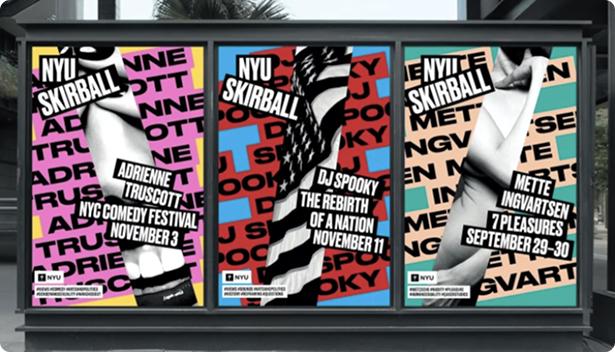
You’ll also be seeing more doodles, hand-drawn elements, and collage too. People are hungry for designs that have a human touch, even when (and because) they’re a bit rough around the edges. By the way, hats off to you trendsetters who were already living the “more is more” ethos: maximalism is back, with its rich colors, eclectic mix of details, and sense of excess that feels abundant and invites exploration.

5. Shhh—it’s time to quiet the visual noise
There’s a newfound gentleness to design, one that feels soothing after spending a day wading through the digital morass on our screens.
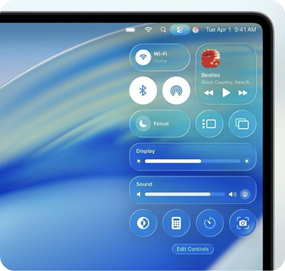
Soft, dynamic gradients bring a more subdued approach to logos; even Google has been rolling out a gradient version of their logo[5]. These gentler directions also increasingly involve motion as well (remember trend #2?) to add dynamism to the approach.
Similarly, fluid, organic shapes are back, even for organizations that operate in hard sciences or technology. And while minimalism isn’t dead, there’s a new emphasis on bringing warmth into it. Think lots of open space, delicate typography, and earth-tone palettes that create an oasis for audiences.

6. The bots are watching—write accordingly
65% of Google searches[6] are now “zero click,” meaning users are getting info from large language models (LLM) and AI tools like ChatGPT without even going to a website. Your human audiences still matter, of course. But now that users are increasingly leaning on LLMs over Google, developers are creating sites for both so that they'll show up in LLM answers.
What does it look like to write for the machines? Enter answer engine optimization (AEO). While there are nuances, these initial guidelines can get you started.
Tips for AEO
- Write the way that humans talk: Use a conversational tone and make your message easy to understand.
- Add FAQs to your website: They reflect the Q&A format that people often use with LLMs.
- Use headings to accurately describe your page content: This makes it digestible for hungry bots.
- Tout your expertise: This adds credibility, and LLMs tend to surface work that’s been cited often.
- Show related content on your page: It keeps both users and bots interested in exploration.
The headlines will have you thinking this is a sea change. It isn’t. A lot of this comes down to well-structured content architecture, content reviews, and thoughtful approaches to copy, which have always been part of best practices for the web.
7. Creative conscientiousness
Every designer can attest to having to balance multiple concerns: client sentiment, platform limitations, color palettes, and more. But designers are also increasingly aware of their impact on audiences and the Earth.
Inclusivity
Designers have the obligation to capture what’s beautiful and vibrant about our world. That means using images that don’t just include people with different identities, but that challenge stereotypes. For example, it’s important to feature images of people who use wheelchairs. But there’s a tendency to always show them with a helper rather than independent moments that speak to day-to-day life.
Accessibility
WCAG compliance has become a no-brainer, and there’s a much stronger understanding of accessibility. (We’ve prioritized it for many years in our website development[7].) Best practices like including alt text on images, not using text in images, and using the correct headings have become the norm, making it easier for users who use assistive technology.
Ethics
As you’ve seen in this report, AI tools are being used by more people with more regularity. But these tools are still made by humans, which is why there are ongoing efforts to combat bias in AI models[8]. That vigilance gets even more critical as these models scale up.
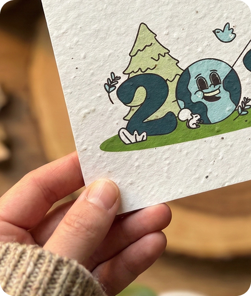
Sustainability
You’ll see more recycled textures and earth-inspired color palettes, which dovetail with other trends we’ve covered. But there’s also the push to design for lower environmental impact overall, such as designing websites that use less energy and using sustainable materials for physical materials.
The start of each year is our chance to balance our present circumstances against our vision for the future. We hope that this trend report helps you do that, and that knowing what’s coming makes it easier to figure out where you’re going.
- https://youtu.be/bT1tG_E8g-4?si=q5EJfo9VpOYTFZcj&t=53
- https://shopify.supply/?utm_source=extension&utm_medium=click&utm_campaign=muzli
- https://mitsloanedtech.mit.edu/ai/basics/effective-prompts/
- https://www.nngroup.com/articles/neobrutalism/
- https://blog.google/inside-google/company-announcements/gradient-g-logo-design/
- https://www.briskon.com/blog/zero-click-searches/
- https://www.opusdesign.us/services/websites
- https://news.mit.edu/2024/researchers-reduce-bias-ai-models-while-preserving-improving-accuracy-1211